 My Clinic is in the United States
 My Clinic is in Canada
In this webinar, our Senior Director of Research, Mike Large, Ph.D., offers an insightful view of how our revolutionary new PGTai technology platform for PGT-A analysis, interpretation and reporting works. Including a brief history of Preimplantation Genetic Testing (PGT) and sequencing technology, you can find out how PGTai technology platform offers a system no longer open to interpretation and transcription errors. For more information check out our PGTai technology platform product page

Introducing Our PGTai Technology Platform
In this webinar our Senior Director of Research, Mike Large, Ph.D., offers an insightful view of our revolutionary new PGTai technology platform for PGT-A analysis, including a brief history of Preimplantation Genetic Testing (PGT) and sequencing technology. You can find out how PGTai technology platform offers a system no longer open to interpretation and transcription errors. For more information check out our PGTai technology platform product page.
To start off, I’d like to talk a little bit about the history of PGT. We’ve been doing PGT for quite some time now, starting off with FISH in 1993. We progressed on to Metaphase CGH in 1999 and the first big breakthrough was in 2008 with microarrays. This was the first time in which we had even representation of the genome with data points – a single data point at every single mega base of the genome – and this gave us nice uniform coverage. It was the gold standard until around 2014 when we moved to next-generation sequencing.
With next-generation sequencing, we went from one data point per megabase to over a million data points throughout the genome. This was a really big breakthrough for the field, but this was four years ago now and that’s a very long time in the field of technology. For reference, we were using the iPhone 5 back then! We’ve since recognized lots of limitations there and as a leader in the industry we wanted to do something new and exciting and that’s PGTai – our new technology platform.
PGTai is a first-of-its-kind, ground-breaking mathematical algorithm that harnesses the power of Big Data, Machine Learning and Artificial Intelligence.
Next Generation Sequencing (NGS)
To start with, I’m going to talk a little bit about sequencing technology, very briefly. What we do today with next-generation sequencing for PGT-A, is we take DNA from an embryo biopsy, we amplify it to make more copies of it so that we have enough to analyse and then we break it into small fragments and we sequence each of those fragments in parallel. We take those sequences and we determine where, in the genome, did the sequence come from. The sequences are called ‘reads’ and the process of aligning them is called ‘mapping to the genome’. We then count the number of reads in any given region and we can use that to infer how much DNA was in that position.
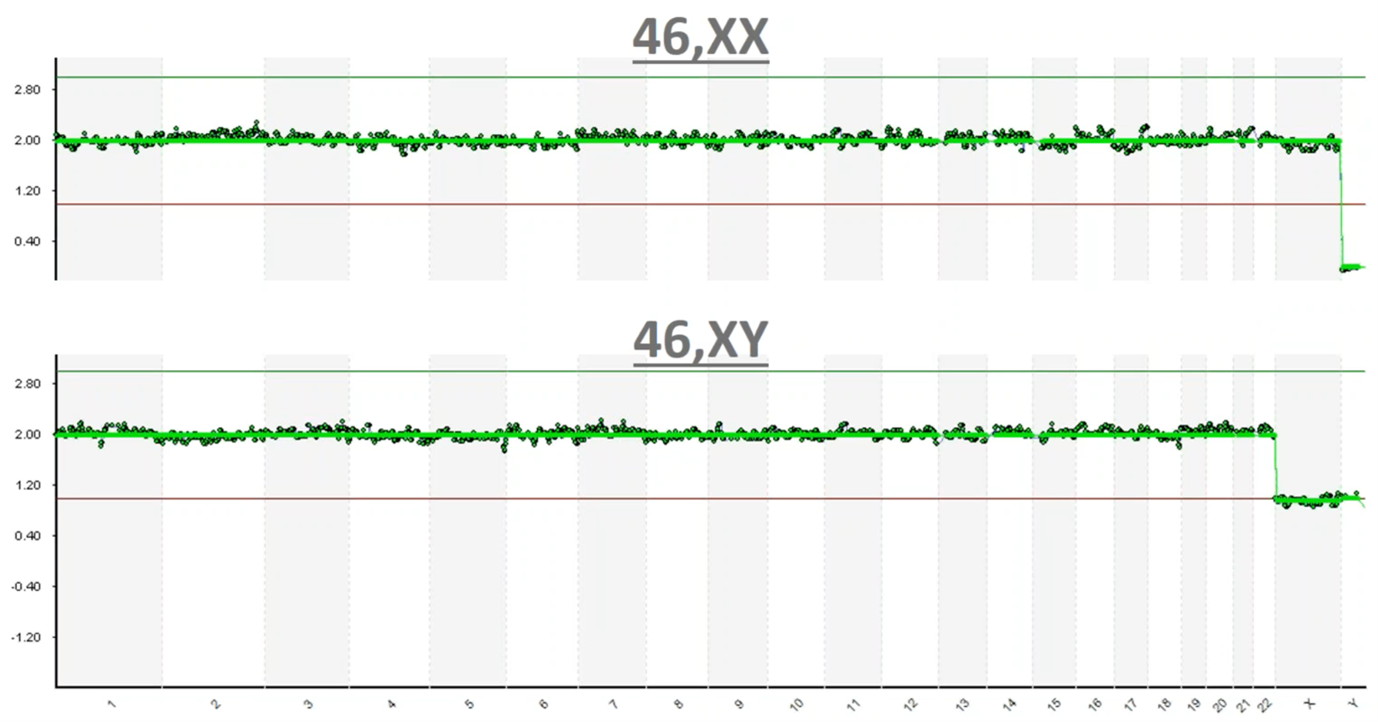
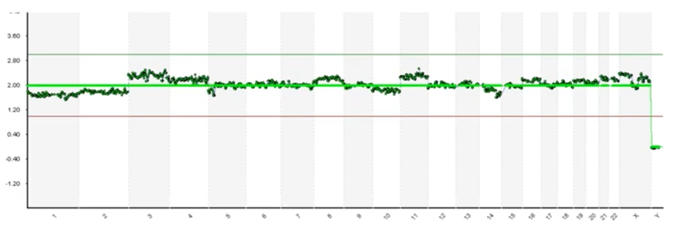
This is an image of what those results typically look like. On the Y-axis we have copy count; humans have two copies of every chromosome and so you can see at 2.0 copies each one of these green dots is a one megabase (one million base pairs) region of the genome. You can see that we have 2.0 copies (with a little bit of noise in the assay) at each chromosome going down the genome – labelled from 1 to chromosome 22 – and then the sex chromosomes are X and Y.
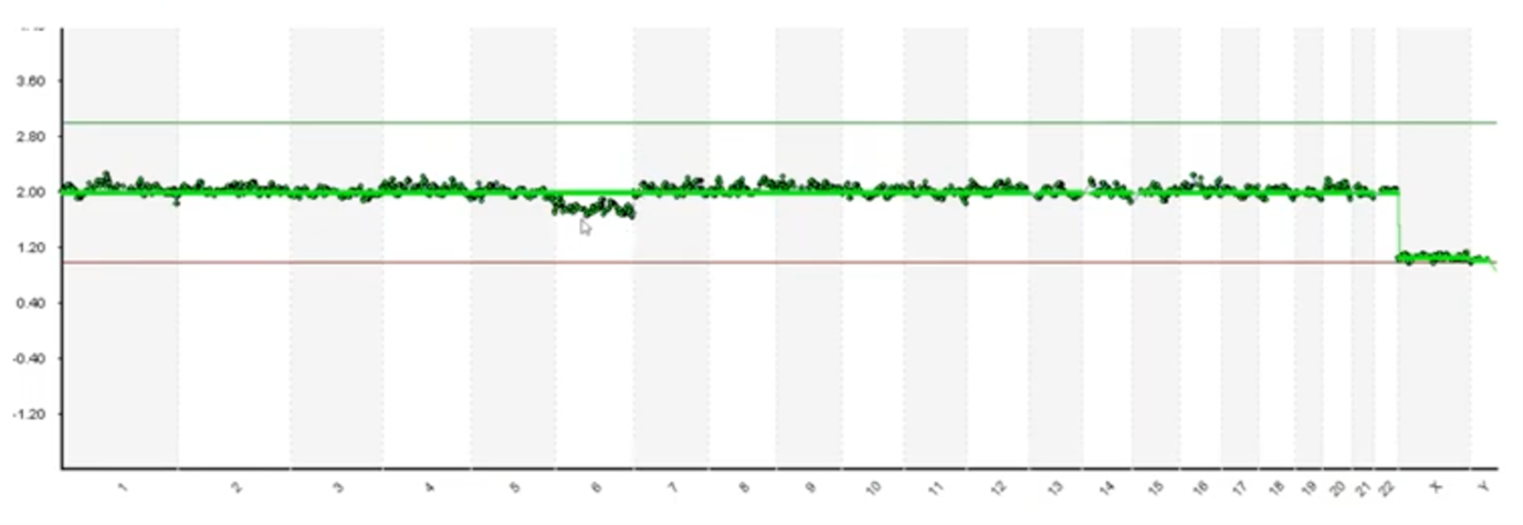
In this top example you can see that we have 2.0 copies of chromosome X and we have zero copies of Y so this is a 46,XX, which is a healthy female. In the bottom example, again you can see that each of the data points is graphing right around 2.0 copies until we get to the sex chromosomes, where now you can see we have one copy of X and one copy of Y and so this is a 46,XY healthy male.
This is essentially how data processing is done today; we take those sequence fragments; they’re converted into images like this and then we have scientists in the lab interpret these pictures.
So just as a recap, I’d like to do a quiz: is this a 46,XX or a 46,XY?…
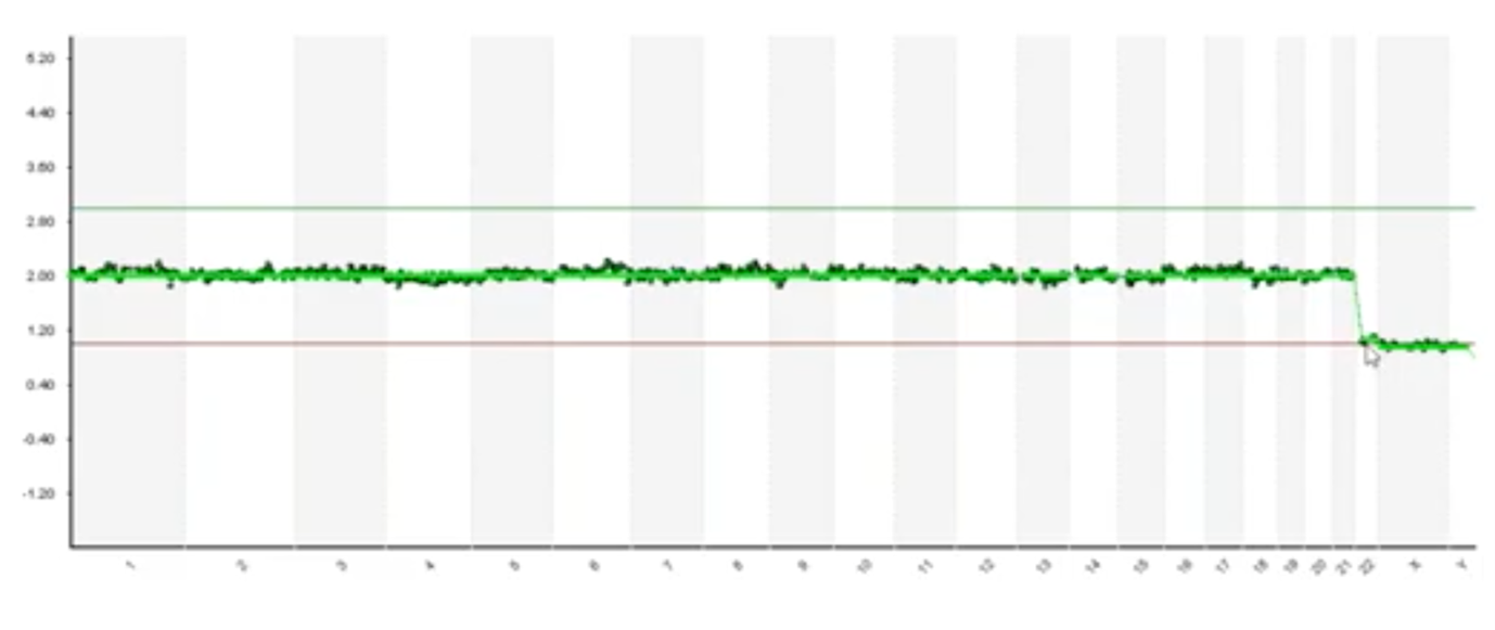
If you’re watching the first part you would see that we have one copy of X and one copy of Y and so you would say 46,XY but, actually, there’s a loss of chromosome 22 here. Every data point for chromosome 22 is that one copy and this is known as monosomy 22 and its incompatible with live birth. So, one of the limitations of using pictures to do sophisticated data interpretation is that its susceptible to interpretation errors.
At Cooper Genomics, we’re very experienced and our staff are trained to look for issues like this. So, let’s say, in a typical situation, I identified that there was a monosomy 22, the next thing I would do is what we call resulting.
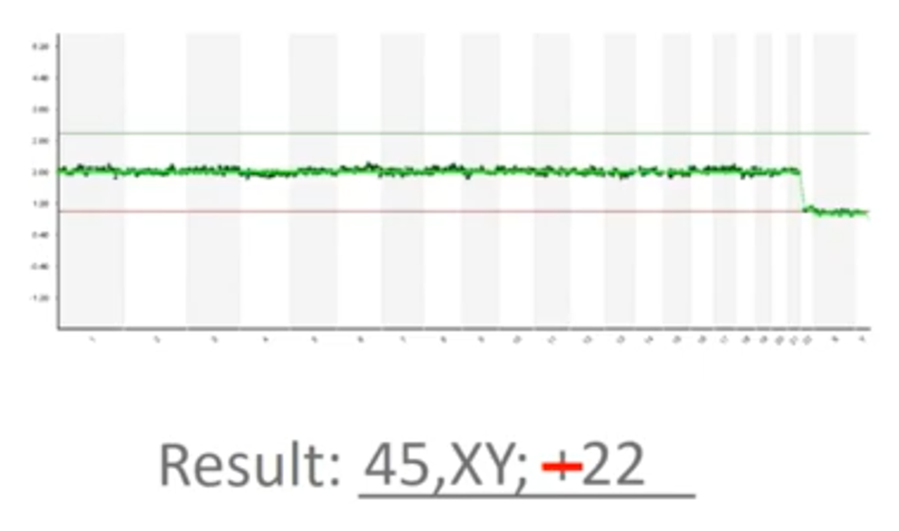
This picture needs to be transcribed into a medical report and so I’m typing “45, XY” (because we’re missing a copy) and then I wrote “+22” there. Now, that’s actually a mistake – it’s minus 22 because we’ve lost a copy of chromosome 22. So, another limitation of the way PGT-A is done today is that it’s susceptible to transcription errors. We must look at the picture and we have to faithfully transcribe it, without typos and without issue.
Some platforms and some software today will generate an automated report for you; using some software, it will identify an abnormal “-22” with a loss of chromosome 22 here and so this can be used to mitigate some of the risk associated with transcription errors. However, the way software was designed back in 2014, they were really intended to identify only a whole chromosome, full-copy changes.
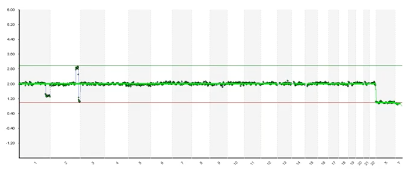
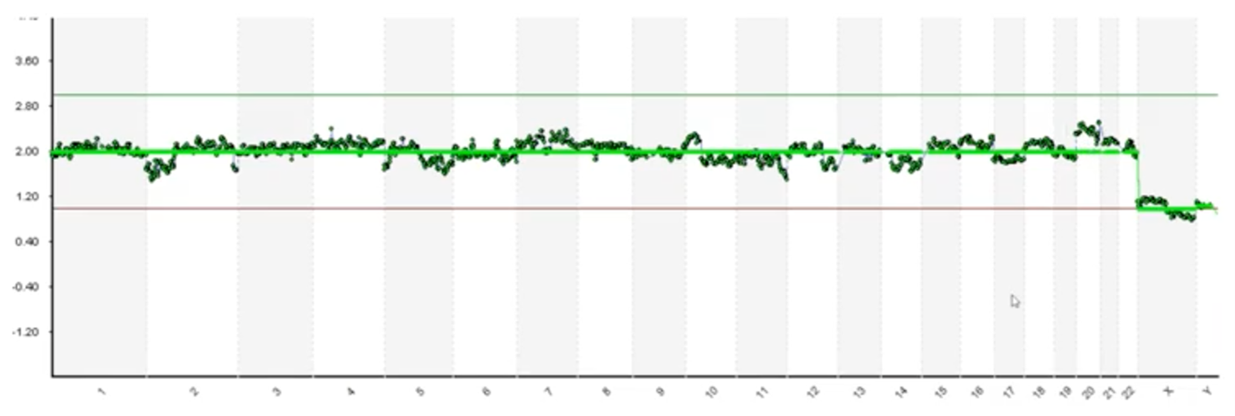
Here’s an example where we have very clear and obvious segmental deletion on the end of chromosome 1 and then we have a duplication and a deletion on at the end of chromosome 2. You can see that the software hasn’t called it. So human interpretation is absolutely required because we do see lots of embryos and biopsies that have issues like this.
Subjective Interpretation
Up until now I’ve shown some examples that are very clear and obvious but not all biopsies and not all DNA is of the same quality.
Here’s an example where it’s much more difficult to identify whether these deviations are assay noise. Various factors influence DNA quality (such as how the biopsy has been handled and the health of the embryo) and it can introduce noise. Alternatively, these may be low-level deviations in the phenomenon known as ‘mosaicism’1. That’s a topic for a different discussion but mosaicism, briefly, is when we have – in a multicellular biopsy – at least two different populations, genetically. So, we may have three normal cells and we may have two cells with a gain of chromosome 11. We call that mosaicism and that data may appear like this. As we look at pictures like these, we’re forced to make subjective interpretations.
Here’s another example with cleaner data but we do have some deviation on chromosome 6. Our scientists have to debate and decipher whether this deviation is in fact a mosaic or if it’s just a noisy issue with the assay.
And, finally, here’s one more example. As someone who’s looked at tens of thousands of these, I may review this profile and determine that most of these blips are noise but this chromosome 20 has got a lot of daylight there. It’s kind of concerns to me and I might be reserved in looking at that. So, the question that we face is which of these blips are real and how do we know?
I’ve reviewed some of the limitations of current practices and there were limitations that we decided we needed to do something to overcome.
Developing Our Own Platform – Requirements
As we set out to develop our own platform, the requirements we gave to ourselves are:
- That we wanted to remove subjectivity; we didn’t want to have to rely on the opinion of scientists. Even though our scientists are highly trained and very experienced we wanted to remove the subjectivity and we wanted to standardize our calling. We wanted every DNA profile to be analysed with the exact same metrics every time.
- We wanted to reduce risk as well. We covered issues of interpretation and risk and transcription errors and we wanted to reduce or eliminate those issues.
- And we also wanted to increase the signal-to-noise ratios. It’s a common problem with technology; anytime you’re measuring things you have the signal and you have the noise, and you want to maximize the signal and minimize the noise to make the most accurate call possible.
- We also wanted to establish truth. I left the last slide talking about which blips are real and how do we know; we wanted to design a system in which we knew what to expect.
- And then, if we did all those things, we would hope to improve accuracy.
Design
As we set out to design the system, some of the things that we wanted to do were first and foremost leverage our Big Data.
Big Data is classically thought of in the three V’s:
- Volume: this signifies lots of data. Over the last four years, as the leader in PGT, CooperSurgical has tested half a million embryo biopsies so we definitely have Big Data there
- Variety: no two embryos are the same and each data point can differ
- Velocity: we sequence nearly 500 embryo biopsies a day and so our data is coming in fast.
We thought it was really unfortunate – or a limitation – that we took all that data and we simply converted it to pictures. We wanted to leverage that using modern tools and data analytics.
We also wanted to leverage an approach in which our analysis was done with rigorous mathematics and statistics because we think that’s far superior to subjectivity and human interpretation.
To mitigate some of those transcription errors, we also wanted our platform to make the calls for us automatically to eliminate the need for transcription.
I also mentioned wanting to establish truth. This is an approach that we were really excited about and is unlike any other platform in the field. To identify what we consider ‘truth’ or to be the factual data behind our algorithms, we used DNA sequences from biopsies that we know went on to produce healthy live births. In that case, if there were any blips or any noise deviations in that sequencing readout, we knew that those were assay noise and that they weren’t clinically significant.
We also use the largest training data sets ever deployed in the field. I just mentioned the euploid live births – we use 1,000 sequencing profiles that led to healthy live births, we used 650 known aneuploidy embryos (embryos that we knew to have genetic abnormalities – we use those to define ‘abnormal’) and we used DNA sequence profiles from 250 known unbalanced translocation carriers (this is a situation in which one of the parents has been identified to be a balanced translocation carrier and, in that case, 50% of the embryos will have small segmental duplications and deletions related to that translocation – this helps us know for certain and to validate our segmental detection ability).
Lastly, I talked a little bit about mosaics and mixtures and, in this situation, what we did is we took pure euploid DNA and we mixed in at predetermined amounts (it was 15% increments) abnormal DNA. Most of the chromosomes that we identified, demonstrated a nice linear dose-response to validate our ability to resolve mixtures also known as mosaics. These were the samples that we use to train our artificial intelligence and our machine learning algorithms and once we taught the algorithms what to look for initially, we then ran 10,000 sequence profiles through it to validate the performance of PGTai.
Building a Reference Dataset
Getting into some of the specifics, here’s a hypothetical where we talked about noise versus signal.
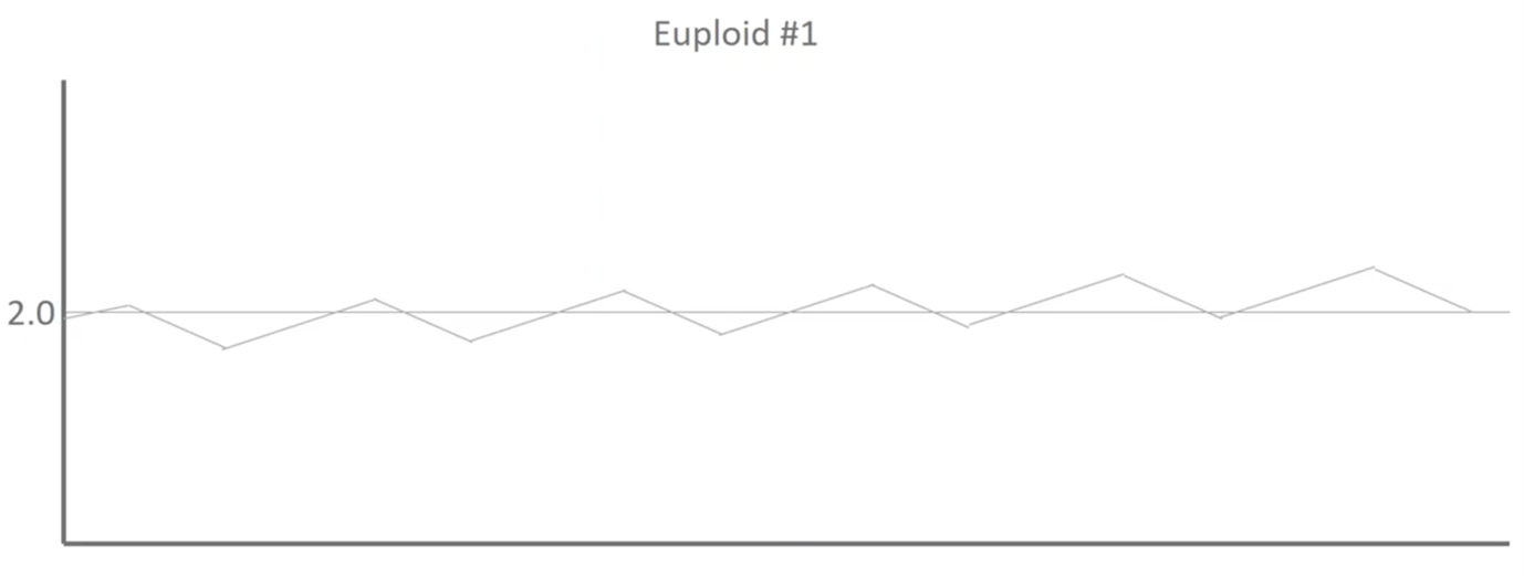
This is Euploid 1 and we can see that there is some noise and deviations moving down the profile but because this DNA led to a healthy baby, we know that these blips are noise and they aren’t biological.
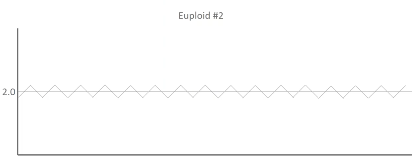
Here’s Euploid 2. It’s got some different deviations moving up and down throughout the profile but, again, there was a healthy baby on the end of this and so we know that those blips are actually assay noise and not biological differences.
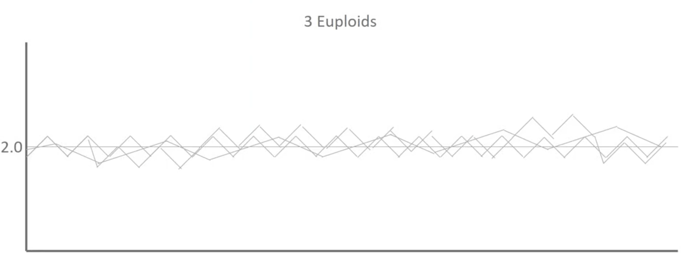
When we overlay those two as well as a third you can see that we start to establish some patterns.
And then this is where we use a thousand euploids:
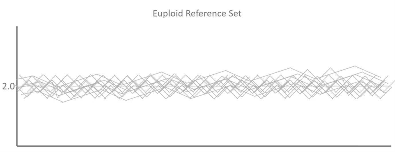
What we’re actually doing when we build a reference dataset in mathematics is we’re trying to determine the average distribution of the signals that we see for every single base pair throughout our three billion base pair genomes, the amount of variability and a noise that we see in a typical population that’s representative of healthy outcomes. We can then use this to make more sophisticated calls.
Once I’ve built that training set now, I’ve got an experimental sample:
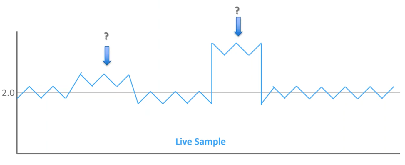
We’ve got a couple of different blips throughout the profile but these two are the ones that stand out most to me. The one on the right obviously stands out clearly, but what about the one on the left? Is that significant?
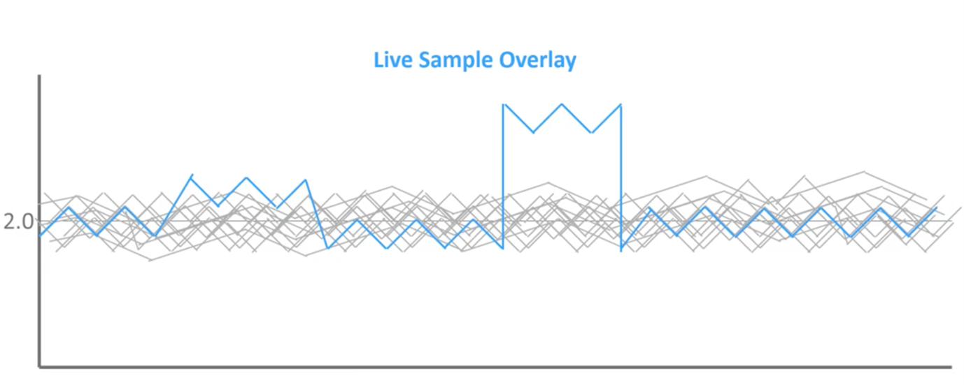
When we overlay it on top of that reference set of known outcomes, we can see that this first blip does not extend beyond the normal reference set, while the second does. So, when we go back to those bell curves of normal distribution, we can see that left blips are within what we expect to see in a healthy population, so this is noise in the assay. Whereas the blips on right extend beyond the region of normal distribution; therefore, this is mathematically significant, and this should be flagged as an abnormal result.
Artificial Neural Network for Sex Calling
One example of some of the machine learning and artificial intelligence behind what we’ve deployed is artificial neural networks. At the end of the day, this is really quite complicated, but this is an example of one of the neural networks that we’ve used to identify different sex chromosomes.
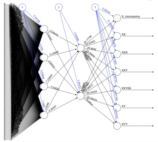
Some particularly challenging situations are identifying XXY versus a triploid XXY, and sophisticated approaches like neural networks are helping us do this in a way that we haven’t been able to do in the past.
Noisy Data and the PGTai Technology Platform Answer
So, then we deployed these types of approaches, I went over some of those difficult to interpret situations earlier.
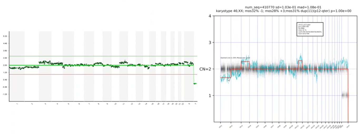
Here was noisy data – we pointed out blips along the way – and here’s our PGT-A technology platform answer. You can see that the platform is automatically calling the abnormal chromosomes – there’s a loss on Chromosome 1, a gain on 3 and 11.
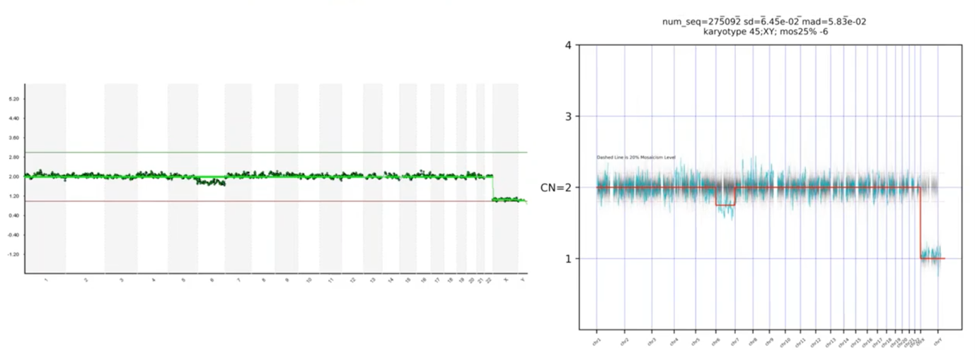
Another example: we asked, is this deviation on Chromosome 6 significant or not? The PGTai technology platform tells us that it is, in fact, significant.
I also mentioned that we wanted our platform to make the calls for us and not need to transcribe it, and you can see – here – where it mentions that the karyotype is a 45,XY, the 25% mosaic loss of Chromosome 6. So, we have a non-subjective, statistical-based calling with automatic resulting.
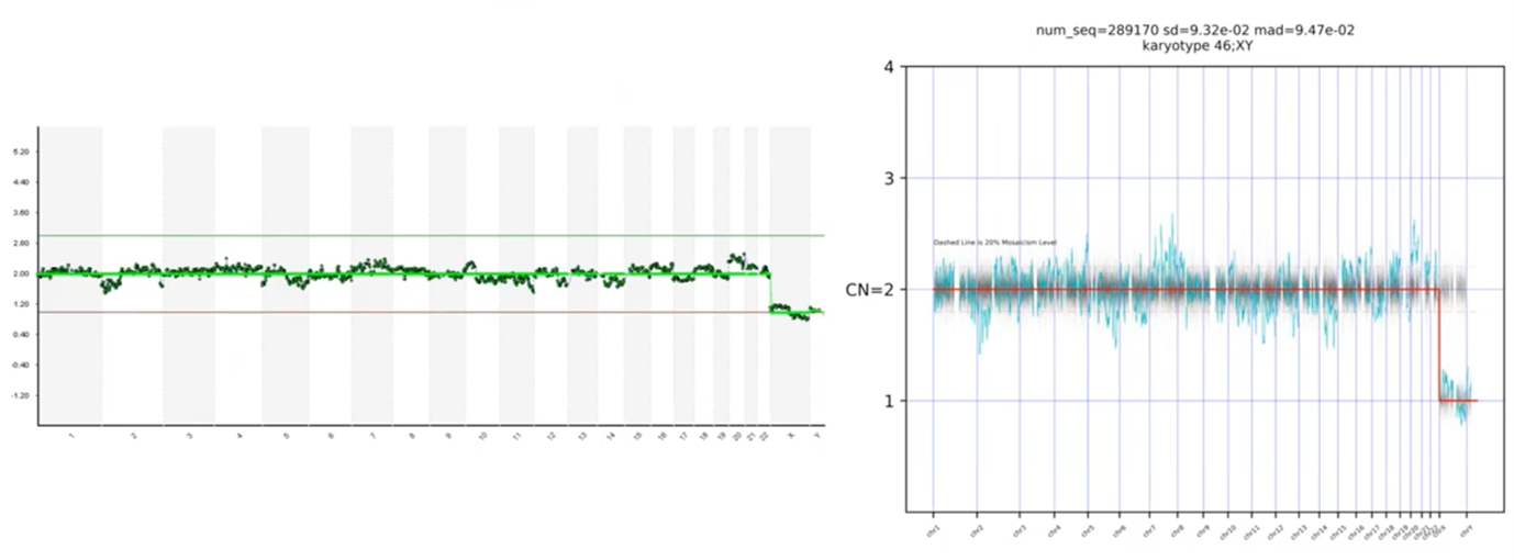
In this last profile, we had asked which of these blips are real. I mentioned that Chromosome 20 was the most concerning to me, but I wasn’t sure about the rest. When you look at the PGTai technology platform answer, we see that none of the data points deviate statistically from the reference data set. Therefore, this profile should be considered 46,XY and available for transfer.
Performance Metrics at Launch
I mentioned that we trained our algorithm on the training set and then we validated on 10,000 biopsies to ensure that the computer was doing exactly what we expected it to do. When we summarize the overall results of that, we saw a 4.5% increase in sensitivity.
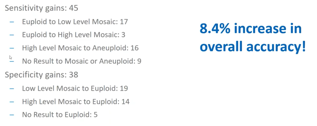
Gains in sensitivity are when we are able to identify abnormal regions that we were previously unable to and you can see that there are various types of circumstances in which we identified the samples to be more abnormal than we originally thought.
We also saw a 3.8% increase in specificity. Specificity is when, because of some of that noise (I just mentioned Chromosome 20 on the previous sample) these are situations in which we previously identified something as ‘abnormal’, but we’ve now identified to be ‘normal’ and available for transfer. That was a 3.8 percent increase.
So, in sum, we saw an overall 8.4% increase in relative accuracy of PGTai over the current – or, I should now say, former approaches to the field.
Summary
At CooperSurgical, we’re dedicated to healthy babies, women and families and we’re really excited about our new breakthrough in PGT-A platform, technology known as PGTai.
About the Presenter: Mike Large
Mike’s graduate work focused on the intersection of progesterone and growth factor signaling, and their role in endometrial receptivity. While finishing his work there, he was recruited by Mark Hughes of Genesis Genetics to open a research and development PGS laboratory in Houston, Texas.
Mike quickly rose to prominence as a technical expert and was instrumental in the adoption and implementation of next generation sequencing in Genesis Genetics labs across the world. Shortly after being acquired by the Cooper Companies, he was promoted to Director of Genomic Laboratories in the newly formed business unit, CooperGenomics.
He continues to passionately invest in advancing preimplantation genomics as a commitment to help people attain happy and healthy families.
Find out more about Mike Large PhD.
Additional References
The following are mentioned throughout the text above and/or are particularly relevant to it. To find out more about each item, please click the link.
- Genomics
- Procedures
- Reference